innogy - Creating a new digital brand appearance
Innogy SE is an energy company based in Essen, Germany.
They wanted to have a microsite design template for all the events the company runs. The objectives of the microsite were to create a platform where people could register their participation and also provide the audience with key information about the events.
THE CHALLENGE
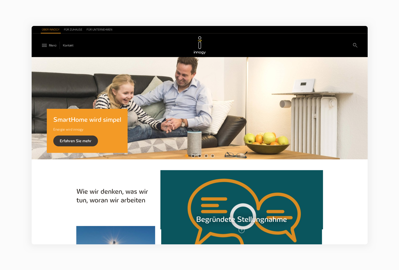
Although the brand has a consistent visual identity in different media. The translation of the visual elements used in the printed materials for the digital ones did not work very well in my opinion.
The lack of breathing space and the misuse of colors give the whole look and feel of their website and other digital interfaces a heavy and outdated appearance. For this reason, it was a request from the brand itself that the current site design was not taken as a visual reference for the creation of the event tool template.
Although the overall appearance is consistent, the digital materials are heavy and outdated. The misuse of colors compromises the clarity of the page and creates friction since there is no visual hierarchy. The different modules "dispute" at the same time the visitor's gaze.
DIGITAL LOOK AND FEEL REDESIGN
My main goal was to improve the two most critical points I found in innogy's website design: Lack of breathing space and misuse of colors. The result was a recycling the existing brand elements, adding more white space and using the colors to create visual hierarchy and guide the reading flow and navigation of the page.
BEFORE AND AFTER


